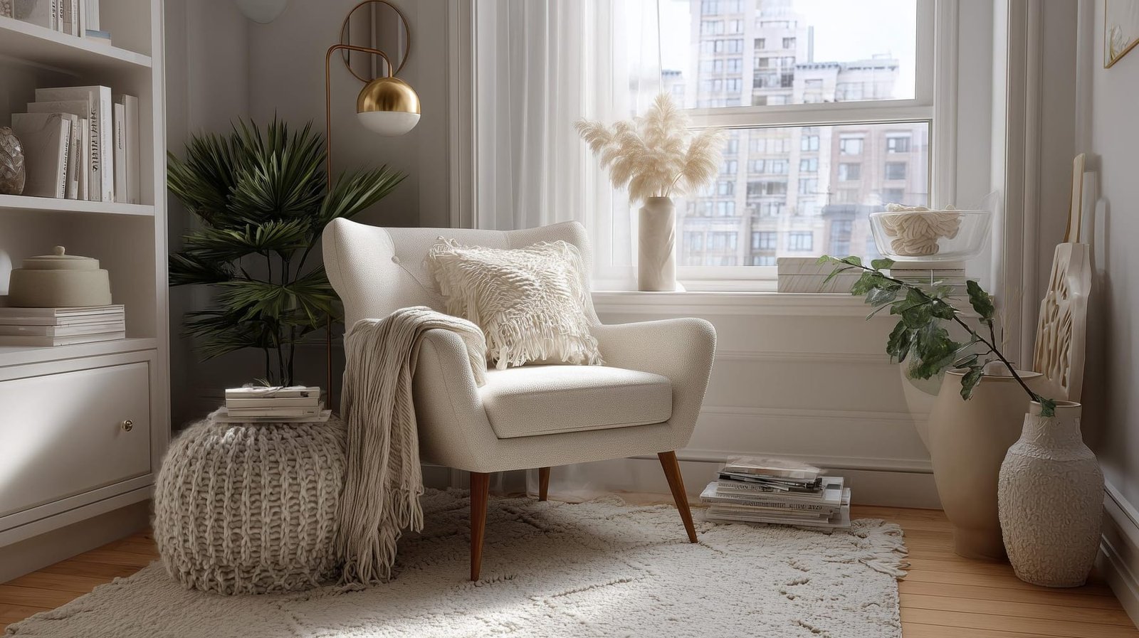
The small mistakes that make a room look cheap
The specific proportion, finish and detailing errors that undermine a room, and the low-cost corrections that make it read as considered instead.
Expensive rooms are not expensive because of what they contain. Plenty of costly rooms look wrong and plenty of inexpensive ones look excellent. The difference is almost always proportion, consistency and finishing, and each of those is a decision rather than a purchase. Here are the specific errors that undermine a room, in the order they are worth fixing, with the correction for each.
Proportion errors, the most damaging category
Nothing signals a poorly considered room faster than things being the wrong size relative to each other.
Art hung too high and too small
The most common single error in domestic interiors. Two rules solve it.
- Height. Hang so the centre of the artwork sits at roughly 1.45–1.55m (57–61") from the floor, which is conventional gallery eye level. In a room where you are mostly seated, drop it slightly.
- Relationship. Art above furniture should relate to the furniture, not the wall. Hang it so the bottom edge sits 150–250mm (6–10") above a sofa back or console top, and make the piece or group roughly two thirds the width of the furniture below.
A single small frame floating high on a large wall is the classic failure. If you only own small pieces, group them into one arrangement with consistent 50–75mm (2–3") gaps and treat the group as a single rectangle.
Curtains that stop short
Curtains hung on a pole just above the window frame, ending at the sill, make a window look small and the ceiling low. Hang the pole high, near the ceiling or 150–300mm (6–12") above the window head, extend it 150–250mm (6–10") past the reveal each side, and run the fabric to the floor. Same window, same cost of fabric within reason, entirely different room.
Skimpy curtains are the other half of this. A curtain that only just covers the window when closed reads as thin. Aim for enough width that the closed curtain has real fullness rather than lying flat.
Undersized rugs
A small rug floating in the middle of a seating group makes the furniture look like it is stranded. The sizing options are set out in living room layout dimensions, but the short version is to buy larger than feels necessary and get the front legs of the seating onto it.
Furniture pushed to the walls
Ringing a room with furniture against every wall makes the middle a void and the edges a corridor. Even in a small room, pulling seating 100–150mm (4–6") off the wall reads as intentional.
:::tip Photograph the room on your phone and look at the photo. A camera flattens the scene and proportion errors that your eye had accepted become obvious instantly. It is the cheapest design review available. :::
Finish and material giveaways
Fake materials in the wrong light
Printed timber grain, moulded stone effect and plastic weave are betrayed by two things: pattern repeat and painted-on shadow. In raking daylight the repeat becomes visible and the shadows look wrong because they do not move.
Where budget is limited, honest plain materials beat imitation ones. A plain painted MDF door looks better than a printed woodgrain one. A plain matt tile looks better than a photographic marble-effect tile whose veins repeat every fourth piece.
Gloss on an imperfect surface
High-sheen paint on a bumpy old wall advertises every ripple. So does a large mirror, a gloss tile or a high-gloss cabinet front on an out-of-plumb run. Match the sheen to the substrate you actually have, as covered in the paint colour and sheen guide.
Visible plastic trims and edges
Plastic tile trims, unfinished laminate edges, exposed cut edges on worktops and gappy scribes at walls are the details a professional installer fixes and a rushed one leaves. Where a trim is unavoidable, choose one that is deliberate: an aluminium or brass profile reads as detailing, while a bendy plastic one reads as a shortcut.
Poor tolerances and unfinished junctions
- Gaps between skirting and floor left unfilled.
- Silicone applied in a wavy bead over the top of an existing failed one.
- Sockets and switches sitting proud of the wall, not level with each other, or set at inconsistent heights.
- Radiator pipes emerging at an angle.
- Doors that catch on the frame or drop when opened.
None of these are expensive to correct. All of them are read subconsciously as "cheap".
Lighting and colour errors
Mixed colour temperatures
Two bulbs in one room at different kelvin values look like a fault. Standardise, and remember that light fitting bulbs and integrated LEDs in joinery need to match too. The full argument is in the layered lighting plan.
One central ceiling light doing everything
A single overhead source flattens faces, darkens corners and makes any room look like a rental viewing. Three or more sources at different heights is the fix, and it costs less than most people assume.
Cool white in living spaces
A 4000K or 5000K bulb in a sitting room or bedroom makes fabrics look grey and skin look tired. Reserve cool light for utility spaces.
Brilliant white everywhere by default
Stark white walls with white trim and white ceiling can look excellent when the plasterwork is good and the light is generous. In a north-facing room with bumpy walls, it reads as grey and unfinished. Choose the white deliberately, checking undertones, rather than defaulting to the brightest one on the shelf.
Styling habits worth dropping
The matched suite
Sofa, loveseat and armchair in identical fabric, or a bedroom set where every piece shares the same finish, reads as bought-in-one-transaction. Mix frames, mix woods, keep a common thread. The mechanism for doing this without chaos is set out in how to mix textures and patterns.
Too much matching metal, or none
One dominant metal, one secondary, each repeated at least twice. A single odd finish among many reads as a leftover part.
Objects scattered thinly
A few small items spread evenly across every surface looks like clutter. Group objects in odd numbers with varied heights, and leave whole surfaces genuinely empty. Empty surface is a design element, not wasted space.
Everything at the same height
A room where every object sits between 700mm and 1m (28–39") is monotonous. Deliberately introduce something tall: a floor-to-near-ceiling bookcase, a large plant, a tall mirror, full-height curtains. Vertical elements are what make a standard 2.4m (8') ceiling feel generous.
Visible cables and technology
Trailing cables under a wall-mounted television, a router on a bookshelf and a tangle behind a desk undo a great deal of careful work. Cable trunking painted to match the wall, a cable box, adhesive clips under a desktop and a router relocated into a cupboard cost very little and take an afternoon.
:::note The consistent theme is legibility. Cheapness is rarely about material cost. It is about the eye detecting inconsistency: mismatched sheens, misaligned lines, uneven gaps, arbitrary heights. Consistency is free. :::
Where spending a little more genuinely shows
Some upgrades are visible out of proportion to their cost.
| Upgrade | Relative cost | Visible impact |
|---|---|---|
| Full-length, generously wide curtains | Moderate | Very high |
| Larger rug | Moderate to high | Very high |
| Replacing plastic switch plates with metal | Low | Moderate, especially in a hallway |
| Upgrading cabinet handles | Low | High on an otherwise plain kitchen |
| Solid-core internal doors instead of hollow | Moderate | High, in sound and in feel |
| Proper picture framing with a wide mount | Moderate | High |
| Three lamps instead of one pendant | Low | Very high |
| Deeper skirting in a period room | Moderate | High, restores proportion |
:::budget If you have a small budget and one room to improve, the reliable sequence is: fix the lighting, then size the rug and curtains correctly, then hang the art at the right height, then declutter surfaces. All four together typically cost less than one piece of new furniture and change the room far more. :::
Details that quietly signal care
- Skirting and architrave depth in proportion to the ceiling height. A tall Victorian room with 70mm (2.75") skirting looks wrong.
- Consistent switch and socket heights throughout the house. If you are renovating, agree them once and hold them, following the sequencing in renovation order of work.
- Doors that close with one push, properly hung and adjusted.
- A single flooring material running through connected spaces, rather than a change at every threshold.
- Real plants rather than dusty artificial ones, or none at all.
- Bin, radiator and clutter positions planned, not left as an afterthought in the best corner of the room.
The short version
- Proportion errors do more damage than any material choice. Fix art height, curtain length and rug size first.
- Hang art centred around 1.45–1.55m (57–61"), and 150–250mm (6–10") above the furniture beneath it.
- Take curtains to the ceiling and to the floor, wider than the window on both sides.
- Choose honest plain materials over imitation ones, and match sheen to the quality of the substrate.
- Standardise colour temperature, use three or more light sources per room, and never leave a single central pendant to do everything.
- Hide cables, group objects in threes, leave surfaces empty and introduce at least one tall vertical element.
Written by
The HDI Editorial Desk
Editorial team
Research, drawings and fact-checking for every guide on Home Designing Idea.
Get the next one by email
One considered piece every other Thursday. No affiliate links.
Keep reading
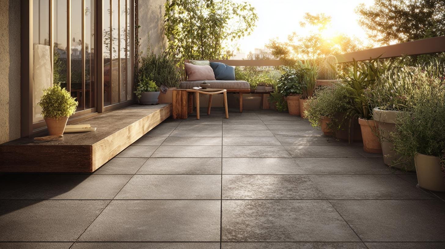
Small balcony planning for seating, shade and drainage
Turn a narrow balcony or courtyard into a usable room with real furniture dimensions, weight limits, drainage checks and planting that survives.
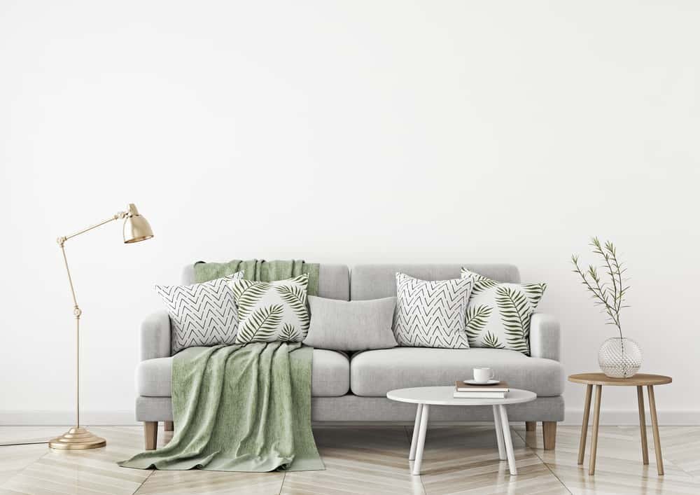
How to mix textures and patterns without the chaos
Combine pattern scales, weaves and finishes using a workable ratio system so a room reads as layered and considered rather than busy.

What is the difference between a studio roof and a gable roof?
When you’re looking at installing a new sunroom, it can be easy to get caught up in the big picture, planning out what to do with all the extra space and how you’ll entertain throughout the year with…
Be the first to comment
Loading the thread…