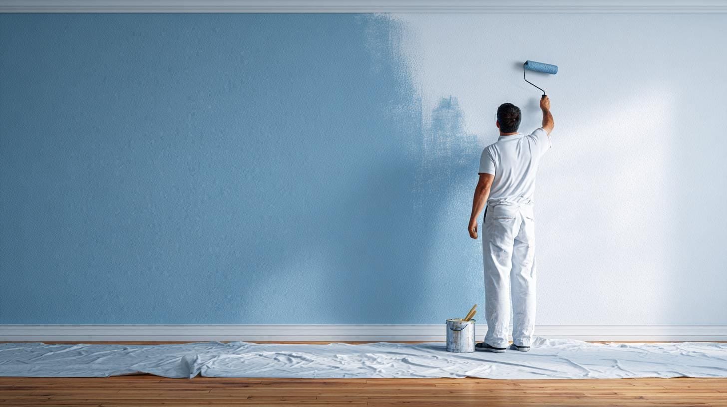
Choosing paint colour and sheen without regretting it
Test colour the way decorators do, pick the right sheen for each surface, and understand undertones before you commit a whole room to a swatch.
Paint is the cheapest way to change a room and the easiest thing to get wrong, because a 50mm chip in a shop tells you almost nothing about how a colour behaves on four walls in your light. This guide covers how to sample properly, how to read undertones and LRV, and how to pick the right sheen for each surface so the finish survives contact with real life.
How to test a colour so the test means something
Sample big, sample twice
A tiny brushed patch surrounded by your existing wall colour will always read wrong, because the eye judges colour relative to what surrounds it. Do this instead:
- Paint two coats onto a piece of white A2 card or lining paper, at least 300 x 400mm (12 x 16"), leaving a white border.
- Make two or three of the same colour.
- Move them around the room: one on the wall facing the window, one on the wall beside it, one on the darkest wall.
- Look at all of them at three times of day, and again at night under your actual bulbs.
Movable boards beat painted patches for two reasons. They can be repositioned, and they do not leave a grid of rectangles to cover later. The white border stops the old wall colour contaminating your judgement.
Light direction changes everything
The orientation of the window is the single largest influence on how a colour behaves.
- North-facing rooms get cool, steady, indirect light. Cool greys turn blue and lifeless; colours with a warm or yellow base hold up better. Very pale colours can look grey and slightly dirty.
- South-facing rooms get warm, strong light for much of the day. They can take cool colours, deep colours and strong pigments without going flat.
- East-facing rooms are bright and cool in the morning, dim and warm later. Test in both.
- West-facing rooms are the reverse, and colours can turn distinctly orange in the late afternoon.
Artificial light matters as much in winter. A colour chosen under a 4000K bulb will look different under 2700K, so fix your bulbs before you fix your colour. The reasoning is set out in the layered lighting plan.
:::tip Test the ceiling colour too. A brilliant white ceiling above a warm, muted wall colour often looks harsh and unfinished. Bringing the wall colour into the ceiling at roughly a quarter or half strength usually softens the join without darkening the room noticeably. :::
Reading a colour properly
LRV, the number worth knowing
Light reflectance value is a figure from 0 (absolute black) to 100 (pure white) that describes how much visible light a colour reflects. Most paint brands publish it. It is the most objective piece of information on a colour card.
Rough working bands:
| LRV band | Behaviour | Typical use |
|---|---|---|
| 80+ | Very light, reflects a lot, can glare in bright rooms | Ceilings, small dark rooms |
| 60–79 | Light, forgiving, keeps rooms feeling open | Most living spaces |
| 40–59 | Mid-tone, colour clearly readable, shows less scuffing | Feature walls, joinery, hallways |
| 20–39 | Deep, absorbs light, needs good lamp coverage | Snugs, dining rooms, bedrooms |
| Below 20 | Very dark, edges disappear, walls recede | Dramatic rooms, small rooms treated boldly |
Two colours can look identical on a chart and behave differently in the room if their LRVs are ten points apart. If a shade you like is nearly right but "too much", look for the same hue family five to ten LRV points lighter rather than a different colour.
Undertones
Almost no paint is a pure hue. Whites and greys in particular carry a bias that only becomes obvious at scale.
- Warm whites lean yellow, cream or pink. They flatter timber, brass and terracotta.
- Cool whites lean blue or grey. They suit chrome, cool stone and north-light rooms only if the light is strong.
- Greige carries both, which is why it can look muddy against strong greens or blues.
- Greys are often blue-based, green-based or violet-based. A blue-grey next to a green-grey looks like a mistake, not a scheme.
The practical test is comparison. Put three candidate whites side by side on card. The undertone appears instantly next to its neighbours, and disappears when the sample is alone.
Building a scheme
A durable approach is a dominant, a secondary and an accent, in a rough ratio of 60 / 30 / 10. The dominant is usually the walls, the secondary the large furniture or joinery, the accent the textiles and small objects.
Keep the dominant and secondary in the same temperature family and let the accent break the rule. Mixing warm walls with cool joinery is the most common reason a scheme feels unresolved, and the same principle underlies mixing textures and patterns.
Choosing sheen by surface
Sheen is durability and light behaviour, not just look. Higher sheen is tougher and easier to wipe, but it reflects more and therefore shows every imperfection in the surface beneath.
| Finish | Reflectance | Durability | Best on | Avoid on |
|---|---|---|---|---|
| Flat / matt | Very low | Low, marks easily | Ceilings, low-traffic walls, uneven old plaster | Kitchens, kids' rooms, skirting |
| Matt emulsion, washable grade | Low | Moderate | Most walls in occupied rooms | Areas of constant splash |
| Eggshell / low sheen | Low-medium | Good | Hallways, joinery, bathrooms, kitchen walls | Very uneven walls |
| Satin | Medium | Very good | Joinery, doors, trim, utility rooms | Large uneven wall areas |
| Gloss | High | Highest | Traditional trim, metalwork, high-wear edges | Anything with a poor substrate |
Practical rules
- Uneven walls need matt. In an older property with bowed, patched plaster, matt hides what satin advertises. This is not a preference, it is physics.
- Hallways need washability. A washable matt or eggshell on hall and stair walls will still look reasonable after two years of bags and shoulders.
- Bathrooms and kitchens need moisture-tolerant finishes, but they are no substitute for extraction, which is the actual fix, as covered in bathroom ventilation and waterproofing.
- Trim can be lower sheen than tradition suggests. Eggshell or satin on skirting and doors looks contemporary and hides brush marks better than gloss.
- Never mix sheens within one plane. Touching up matt with a satin from the same tin colour leaves a visible patch.
:::warning Water-based and oil-based systems do not always bond over each other. Water-based trim paint over old oil-based gloss needs the surface abraded and, in most cases, a bonding primer. Skipping that step is why fresh trim paint peels off in sheets a year later. :::
Preparation and quantities
Order of operations
- Fill, sand, dust off. Almost all bad paintwork is a preparation failure, not a paint failure.
- Spot-prime fillers and any bare substrate, or the repairs will flash through as dull patches.
- Ceiling first, then walls, then trim last. Working top down means drips land on unfinished surfaces.
- Two coats as standard. Strong colours over pale, and pale over strong, may need three.
New plaster
Fresh plaster must dry thoroughly before a permanent paint system, which takes weeks rather than days depending on thickness, ventilation and season. Apply a mist coat, a diluted emulsion, first so the plaster can continue to breathe and the paint keys properly. Sealing damp plaster with a full-strength vinyl paint traps moisture and causes peeling.
How much to buy
Coverage varies by product and surface, and the tin states a rate per litre. Calculate wall area as perimeter multiplied by height, deduct nothing for doors and windows unless they are very large, and multiply by the number of coats. Buy the full quantity in one go so the batch matches, and keep the leftovers labelled by room for touch-ups.
:::budget The gap between trade paint and premium designer paint is smaller in performance than in pigment depth and consistency. If the colour is a soft neutral, a good trade product will look almost identical for a fraction of the outlay. If the colour is a deep, saturated shade, the premium product's opacity may genuinely save you a coat. :::
Where colour does the heavy lifting
- Small dark rooms. Fighting the darkness with brilliant white usually fails, because the room simply looks grey. Leaning into a deep colour with good lamp coverage often reads far better.
- Awkward architecture. Painting walls, trim and any radiator cover in one colour and one sheen family makes lumpy rooms calm down. Contrasting trim draws a line around every oddity.
- Built-in joinery. Matching joinery to the wall makes it read as architecture rather than furniture, which is central to small-space storage without gimmicks.
- Doors. Painting the door face that faces into a room to match that room, and the reverse face to match the hall, is an old decorator's trick that costs nothing.
The short version
- Sample on large white-bordered boards, move them round the room and check at three times of day plus at night.
- Match colour choices to window orientation. North light kills cool greys; south light takes almost anything.
- Use LRV as your objective measure and adjust brightness within the same hue family rather than switching colours.
- Compare candidate whites and greys side by side to expose undertones.
- Matt on imperfect walls, washable matt or eggshell in circulation spaces, eggshell or satin on trim.
- Preparation and priming decide durability. Mist-coat new plaster and abrade old gloss before water-based trim paint.
Written by
The HDI Editorial Desk
Editorial team
Research, drawings and fact-checking for every guide on Home Designing Idea.
Get the next one by email
One considered piece every other Thursday. No affiliate links.
Keep reading

Type of Chemicals Used in Home Paint Production: A Detail Guide
Paint makes our homes beautiful and protects surfaces from damage. Behind the bright colors and smooth finishes is a blend of chemicals that add strength, texture, and durability. But what chemicals…

5 DIY Home Renovations to Increase Value of Your Home
Getting top dollar when it's time to sell your home means improving the appearance of the house. Sometimes, a little money and elbow grease can go a long, long way, such as a fresh coat of paint or…

What Your Home Says About You & It's Time to Upgrade
Your house says a lot about you, from your favorite style of décor to how much you value housework and even your hobbies. Sometimes when it's time to sell your home, your house may say a little too…
Be the first to comment
Loading the thread…