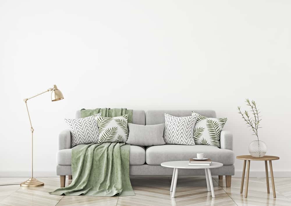
How to mix textures and patterns without the chaos
Combine pattern scales, weaves and finishes using a workable ratio system so a room reads as layered and considered rather than busy.
Rooms that photograph well almost always have several materials doing different jobs at once: something rough, something smooth, something soft, something that reflects. Rooms that feel flat usually have one texture repeated everywhere. This article gives you a working method for combining textures and patterns, including the ratios, the scale rules and the specific combinations that reliably fail.
Texture is what a photograph cannot sell you
Colour gets all the attention, but texture is what makes a room feel like somewhere rather than like a rendering. It works because of how light behaves on a surface.
The four texture families
Think of every surface in a room as belonging to one of these:
- Matt and absorbent. Wool, boucle, linen, unglazed ceramic, limewash, matt paint. Absorbs light, softens sound, feels calm.
- Smooth and hard. Glass, polished stone, lacquer, gloss tile, steel. Reflects light, sharpens edges, feels cool.
- Grained and irregular. Timber, rattan, sisal, exposed brick, hand-thrown pottery, slubby weaves. Catches shadow, reads as natural and forgiving.
- Reflective and metallic. Brass, chrome, mirror, glazed ceramic. Adds sparkle and depth in small quantities.
A resolved room has all four present, in very unequal amounts.
A workable ratio
Aim for roughly:
- 60 per cent from one dominant family, usually matt and soft in a living room or bedroom, usually hard and smooth in a kitchen or bathroom.
- 30 per cent from a contrasting family.
- 10 per cent split between the remaining two, with reflective as the smallest share.
The failure mode of a minimalist scheme is 100 per cent smooth. The failure mode of a cottage scheme is 100 per cent grained. Both feel like one note held too long.
:::tip Stand in the doorway and count the materials you can see. Under four and the room will feel flat. Over about eight competing materials and it will feel unresolved. This one-minute audit catches most problems. :::
Making pattern work
Vary the scale, hold the colour
The reliable formula for combining patterns is: different scales, shared palette.
Use three sizes.
- Large. One large-scale pattern per zone, and only one. A big floral, a wide stripe, a bold geometric. This is the anchor and it usually goes on the largest surface: curtains, a rug, a headboard.
- Medium. Two or three medium patterns. A small check, a mid-scale print, a woven texture with visible structure.
- Small. Ticking stripes, tiny dots, fine herringbone. These read almost as solid from across the room and act as connective tissue.
If two patterns are the same scale and the same intensity, they fight. If they are three scales apart with a colour in common, they cooperate.
The shared colour thread
Every pattern in a group should share at least one colour with at least one other. That single shared thread is doing more work than any other rule here. It does not need to be the dominant colour in each pattern; a thin line of ochre running through three otherwise unrelated fabrics will hold them together.
This ties directly to the temperature discipline in the paint colour and sheen guide. Patterns that share a hue but not a temperature, a warm red and a cool crimson for instance, still read as a clash.
Include solids and negative space
Pattern needs somewhere to rest. A rough working split for a patterned scheme is one third pattern, two thirds plain. The plain surfaces are not wasted, they are what makes the pattern readable.
Pattern direction
Mix organic with geometric. Two florals of different scale can work, but a floral, a stripe and a geometric of different scales almost always work better, because the eye distinguishes them instantly.
| Pairing | Result | Why |
|---|---|---|
| Large floral + fine stripe | Reliable | Maximum scale and character contrast |
| Wide stripe + small geometric | Reliable | Different direction, different scale |
| Two mid-scale florals | Risky | Same scale, same character |
| Large geometric + large geometric | Usually fails | Both demand to be the focal point |
| Any pattern + plain textured weave | Always safe | The weave adds interest without competing |
Building a layered room in practice
Start with the largest surfaces
Work from big to small: floor, walls, window, large upholstery, then cushions, throws and objects. Decisions made at the small end cannot rescue a mismatch at the large end.
On the floor, a natural fibre rug such as sisal or jute is one of the most useful base layers in decorating, because it adds grain and irregularity without adding colour or pattern. Layering a smaller patterned or soft rug over the top of a large natural one is a well-worn move that works, and it also solves the rug-sizing problem described in living room layout dimensions.
Window treatments
Curtains contribute an enormous area of texture. Heavier weaves, linens and wools bring softness and improve acoustics noticeably in a hard room. Hang the pole high, close to the ceiling or above the window head by 150–300mm (6–12"), and wide enough that the stacked fabric clears the glass. Curtains should generally be full length and just clear the floor, or break very slightly on it. Curtains stopping at the sill in a full-height window make a room look mean.
Cushions and throws, without the showroom look
Odd numbers, mixed sizes, and no matched pairs everywhere. A workable formula for a three-seat sofa: two large plain cushions at the outer ends, two medium patterned in front of them, one small contrasting in the centre, plus one throw draped from a single corner rather than folded symmetrically.
Mix at least three textures within that group: a smooth cotton or velvet, a rough linen or wool, and a structural weave.
Metals and finishes
The rule about never mixing metals is not true, but there is a real discipline underneath it. Use one dominant metal and one secondary, and repeat each at least twice in a room so they read as deliberate. A single brass object among five chrome ones looks like a leftover; three brass objects in a chrome room look like a scheme.
:::note Repetition is the mechanism that turns variety into a scheme. Any element that appears exactly once reads as accidental. Any element repeated three times reads as intentional, even if the three are very different objects. :::
Room-specific application
Hard rooms need soft help
Kitchens and bathrooms default to hard, smooth and reflective. They are noisy and they echo. Add texture where water does not reach: a runner, a timber stool, a linen blind, open shelving in timber, unglazed ceramic. In a kitchen, timber worktop sections, a rattan pendant or a plaster-finish wall break the run of glossy surfaces. Layout comes first though, so read how to choose a kitchen layout before adding anything decorative.
Soft rooms need something hard
A bedroom full of wool, linen and carpet can feel muffled and slightly heavy. Add a hard element: a stone or metal lamp base, a glass or marble bedside surface, a mirror, a lacquered tray. It sharpens the room without making it cold. There is more on the sensory side of bedrooms in bedroom design for better sleep.
Small rooms
Small spaces can take a lot of texture and much less pattern. Texture adds richness without adding visual noise, while a big pattern in a small room can be excellent as a single deliberate gesture or disastrous if repeated. If in doubt in a small room: one bold pattern, everything else textured plain.
The failures to avoid
- The matched set. Sofa, chairs, cushions and curtains all in the same fabric. Nothing to look at.
- Pattern with no plain. Every surface working, the eye with nowhere to rest.
- Same scale everywhere. Three mid-scale prints of equal weight competing for attention.
- One texture family only. Especially all-smooth modern schemes, which read as a showroom rather than a home.
- Fake materials in bright light. Printed timber-effect vinyl and moulded plastic weaves are betrayed by raking daylight, because the pattern repeats and the shadows are painted on rather than real.
- Too many hero pieces. Three statement items in one room cancel each other out.
:::budget Texture is the cheapest kind of luxury. A heavy linen throw, a sisal rug and a hand-thrown ceramic lamp base cost a small fraction of new furniture and change how a room feels more than a new sofa in the same flat fabric would. Secondhand timber furniture is the single best value source of grain and patina. :::
The short version
- Include all four texture families, weighted roughly 60 / 30 / 10 with reflective smallest.
- Combine patterns at three different scales, with only one large-scale pattern per zone.
- Every pattern must share at least one colour with another; that thread does most of the work.
- Keep about two thirds of surfaces plain so the pattern has somewhere to rest.
- Repeat any element at least three times, including metals, so it reads as intentional.
- Add soft texture to hard rooms and a hard element to soft rooms.
Written by
The HDI Editorial Desk
Editorial team
Research, drawings and fact-checking for every guide on Home Designing Idea.
Get the next one by email
One considered piece every other Thursday. No affiliate links.
Keep reading

7 Ways to Level Up Your Home to Be Talk of Your Friends
Like most people, you've probably been spending more time at home in the past year. And you might have realized that it's time you improved the look of your interior space. The good news is that you…
How to Be More Productive when Working from Home
In an era where you can work from anywhere, you ought to make sure that your home office is maximally productive. This allows you to achieve your various objectives and avoid distractions. Lack of…
A layered lighting plan you can build room by room
Build a three-layer lighting scheme with the right colour temperature, switching and lamp positions, starting with what you can change this weekend.
Be the first to comment
Loading the thread…